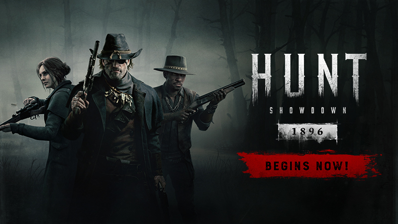
The developers behind Hunt: Showdown 1896 have announced plans to implement significant changes to the game’s user interface (UI) following a surge of negative reviews. Although a recent update initially led to a peak in player numbers, the new UI has been met with widespread dissatisfaction, resulting in a decline in the game’s rating on Steam.
Earlier this year, speculation about a rebranding of Hunt: Showdown emerged after an ESRB rating leak in July hinted at the new title Hunt: Showdown 1896. These speculations were confirmed on 15th August when the game officially rolled out its latest update. This update included a host of changes, such as an engine upgrade, a new map called Mammon’s Gulch, and a comprehensive UI overhaul. The excitement surrounding these changes drove the game to a peak of nearly 60,000 concurrent players, marking the highest player count in the game’s history.
However, despite the update’s success in boosting player numbers, many users have expressed frustration with the new UI. Criticisms have been particularly focused on the redesigned interface, which players have found less intuitive and more cumbersome than its predecessor. This discontent is clearly reflected in recent Steam reviews, which have seen an increase in “mostly negative” ratings, although the overall rating remains “mostly positive”.
Community Backlash and Developer Response
The core of the community’s dissatisfaction lies in the new UI design. Players have criticised it for its lack of user-friendliness, particularly in areas such as hunter and gear selection, inventory management, and filtering options. Some users feel that the new interface disrupts the streamlined gameplay experience they had previously enjoyed.
In response to these concerns, Dennis Schwarz, Design Director for Hunt: Showdown 1896, addressed the issues in a recent video update. Schwarz acknowledged that the new UI had not met expectations and assured players that the team is actively working to address these shortcomings. “We hear you, and we’re committed to making things right,” Schwarz stated, emphasising that player feedback is guiding the forthcoming changes.
Schwarz outlined several key areas where improvements will be made. One of the main focuses will be the Hunter gear screen, which many players have found confusing and difficult to navigate. The team is working on revamping this screen to enhance usability, allowing players to switch between weapons, tools, and traits more seamlessly. Additionally, a new play button will be introduced to simplify access to the lobby screen, making it quicker for players to start matches and navigate between tabs.
Upcoming Changes: What Players Can Expect
Further improvements are also on the horizon. Players will soon be able to change game modes directly from the lobby screen, a feature many have long requested. The mission summary and team details will be merged into a single screen, reducing unnecessary clicks and making important information more accessible.
Another major update will affect the Prestige screen, which has been criticised for its lack of clarity. The revamped screen will more prominently display the rewards available at each Prestige level, helping players make better-informed decisions about their progression.
The announcement of these changes has been met with cautious optimism from the community. While some players are relieved that the developers are taking action, others remain sceptical, pointing out that similar issues have persisted in past updates. Nonetheless, the commitment to ongoing improvements is seen as a positive development, with many hopeful that these changes will restore the game’s appeal.
No Set Timeline for Updates
Despite the encouraging news, Schwarz did not provide a specific timeline for when these updates will be implemented. This has led to some frustration among players eager for a swift resolution. However, the development team has reassured the community that they are working diligently to roll out the changes as quickly as possible.
In the meantime, players are encouraged to continue providing feedback, as the developers have indicated that player input will be crucial in shaping future updates. This ongoing dialogue between the developers and the community is viewed as a positive step, especially given the game’s growing player base.
Future Prospects for Hunt: Showdown 1896
As Hunt: Showdown 1896 continues to evolve, it is evident that the developers are dedicated to addressing player concerns and enhancing the overall experience. While the recent UI overhaul may have been a misstep, the willingness to listen to feedback and make necessary adjustments bodes well for the game’s future.
If the upcoming updates prove successful, they could help Hunt: Showdown 1896 regain its momentum and potentially attract new players who were initially deterred by the negative reviews. For now, the community will be closely watching to see how these changes unfold and whether they will improve the game’s experience.
In conclusion, although the recent UI changes in Hunt: Showdown 1896 have generated significant backlash, the developers’ prompt response offers a hopeful outlook for fans. The coming weeks will be crucial in determining whether these modifications will satisfy the player base and restore the game’s standing in the competitive world of online gaming.
Hunt: Showdown 1896 has navigated challenges before, and with ongoing commitment from both developers and players, it may yet emerge stronger and more refined.


